Design Principle - Task 02: Visual Analysis
PROJECT BRIEF
According to the selected design work from Task 01, we are expected to
study, observe and further analyse the design. To elaborate on design
principles as well as document the purpose of the artwork in detail, and
state the correlation between the aim of the design to our chosen
UNSDG.

Koh Sher Wei | 0353816
Design Principle | Bachelor of Design in Creative Media
List of Content:
>
sources
Recap on chosen artwork
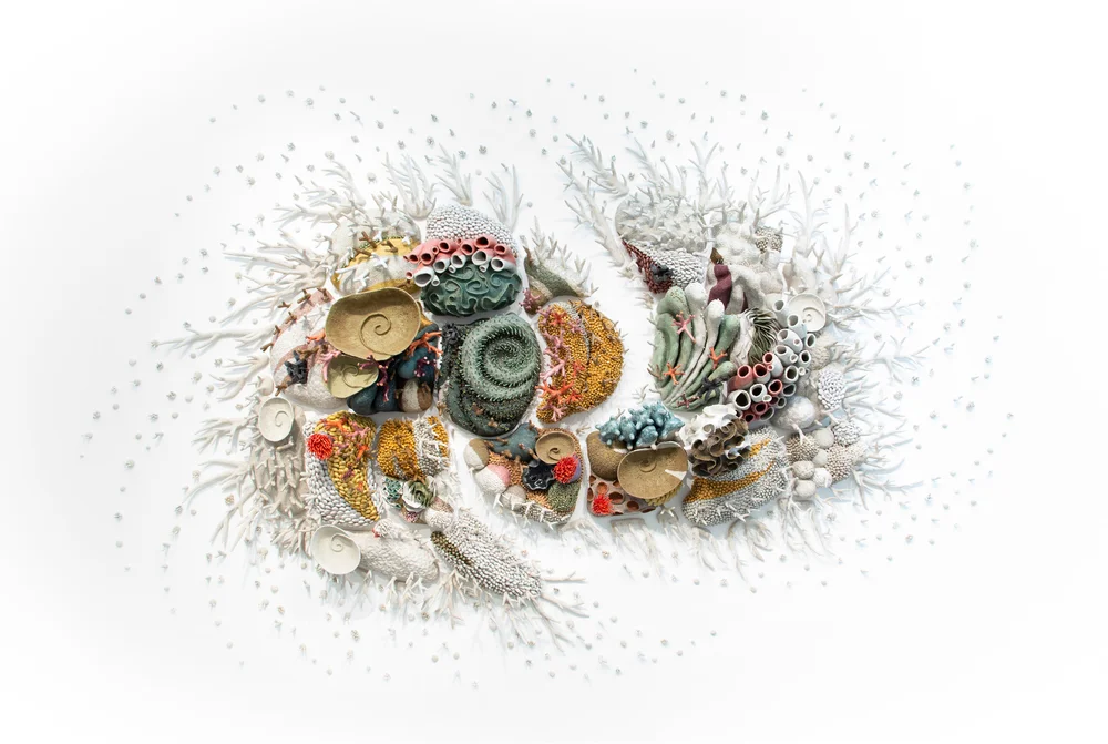
Our Changing Seas IV
By Courtney Mattison
2016-2019
glazed stoneware + porcelain
[335 x 518 x 55cm]
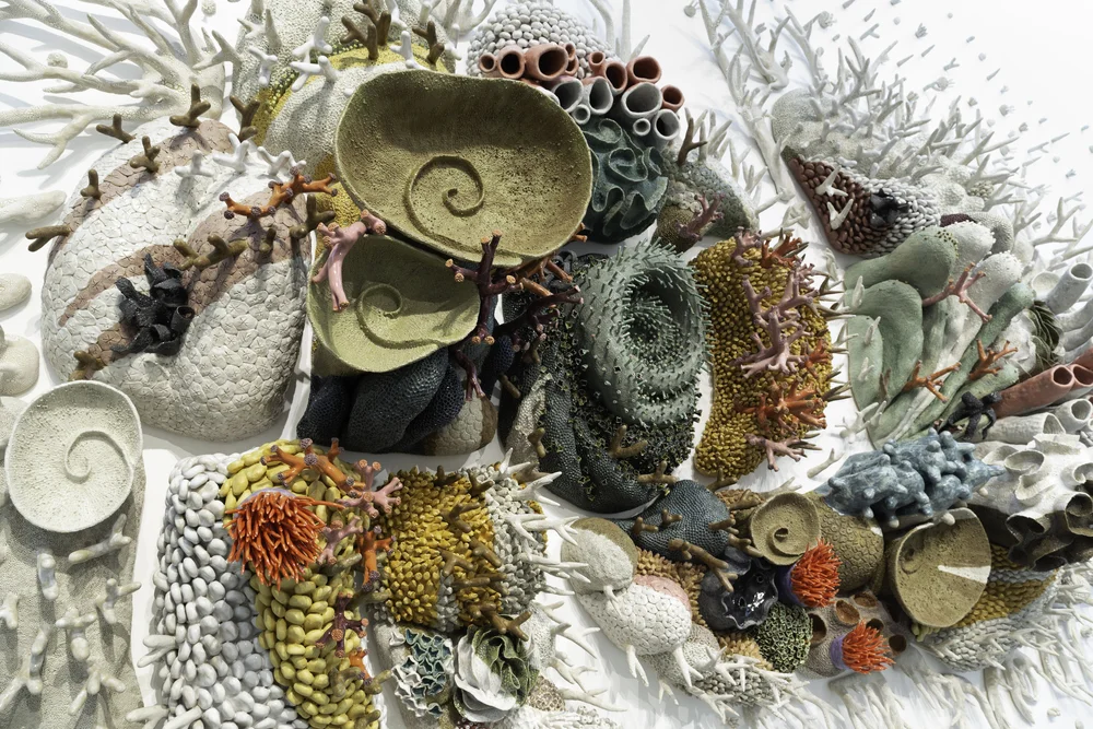
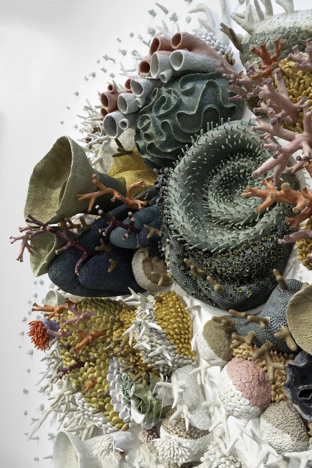
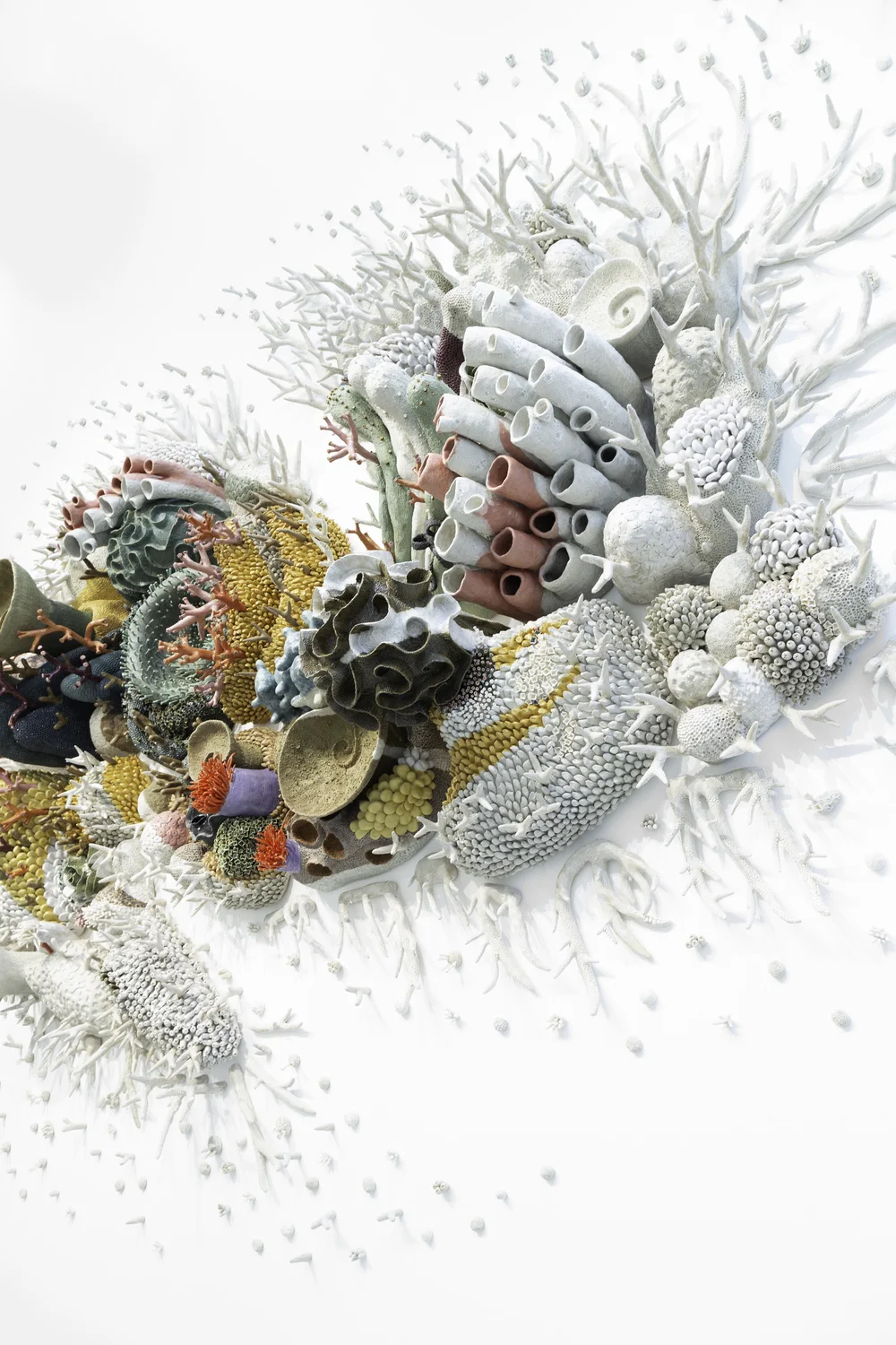
Close-up & details
Visual Analysis
The interesting thing about this artwork, is the fact that it is made up of
different segments of corals. Each of these little segments are composed of
different, intricately carved out coral designs. Like the mushroom-looking coral, the spiral one in the centre, as well as
other more fluid pieces. The corals carry unique patterns, and textures that further express their
individual identities despite the use of some similar pieces in different
segments. All of it is painted in vibrant, eye-catching colours that
compliment one another. It is also to note that multiple tiny nubs, that make up larger pieces, can
be seen littered across different segments. Most of which are painted in
yellow and green, staging pre-maturity and more commonly seen corals, as a
way to blend the larger pieces into one feature. As a result, every segment conveys a distinct tone, yet are able to come together as
one. Feeling almost as if the composition is guiding us along, for a quick
dive into the wide variety of coral species around different parts of the
ocean. Other smaller fragments of coral, that are usually found by the
shore, are also utilised. Being present yet barely visible in the centre
segments, the pieces gradually begin to cover the smoother, less textured
"rocks" that are lacking in coral textures. They gather around the edges of
the main composition, to bring the entire arrangement together. As well as
to show the growth of life that stems from the lively looking
corals.
In terms of composition, this artwork is mostly arranged in close
proximity. However, the individual segments never touch, only slightly
aligned by the edges. Making use of the negative space to bring out the
unity of the segments, and still allowing them to thrive independently. As they
spread across the canvas, they curve into two separate directions, towards
the top and bottom. This movement and placement, directs each piece into an anti-clockwise direction, to make an infinite loop. Consequently, this places an
emphasis
on the coloured corals that make up the centre of the composition. It moves
our focus back into the large segments to keep us intrigued by the colourful
corals. Again, this is highlighted by the contrast in colour vibrancy, and lack of such as the
composition gradually spreads into smaller corals. Stripes of white
between colours are also noticeable, amplifying the movement of the
artwork. A
repetition
of lines can also be seen from the placement of coral branches and nubs,
spreading along the outer space of the canvas. With all this stated,
despite all the intricate details and colourfully sorted corals; the
arrangement is coordinated well and gathers in
harmony.
As we zoom out to the bigger picture, there is an observation to be
addressed. Which is the
symbolisation
of this artwork. It is clear that there is indication of a slight separation
between a section on the left, as well as a smaller section on the right.
Both sections are curved nicely into itself, which appears to make a
complete circle or an oval if properly slotted together. There are many interpretations that can be made; a wave, a tide pool, or
even an infinite sign. To elaborate, each of these alleged images may
represent a relation to the purpose of this artwork; the ocean and its
ecosystem.
If we take a closer look, there is also an underlying pattern that can be
seen on the colour composition of the corals. The incorporation of stripes
throughout the pieces, are not common attributes of corals, but of fishes.
This subtle addition of creativity, clarifies the artwork's focus of
transcribing the beauty and delicacies of the ocean. Furthermore, the
material used is also a connotation of the artists' message. Porcelain is so
delicate, yet extremely beautiful when well made. Fragile but alluring. It
expresses the human urge to protect and treat such delicacies with care, as
it is in our nature to either be envious or afraid of things that put us in
awe. In conclusion, the ultimate aim of this artwork is to bring awareness
to the rapidly decreasing rate of coral reefs, as well as the lack of
consideration for ocean lives.
https://www.artshelp.com/courtney-mattison
https://courtneymattison.com/ourchangingseasiv/tuf9k9pw76610dloi6y0wi9sd4q5p9

Comments
Post a Comment